Verdo
Smart Energy Management App (Case Study)

A mobile app concept that helps users track, understand, and reduce their home energy consumption using smart meter data, designed to shift habits through insight, nudges, and emotional engagement.

Project type
role
time line
TOOLS
The Ask
How can we help everyday users become more energy-aware and reduce unnecessary consumption, without relying on heavy data visualizations or shaming tactics?
The Solution (Design Summary)
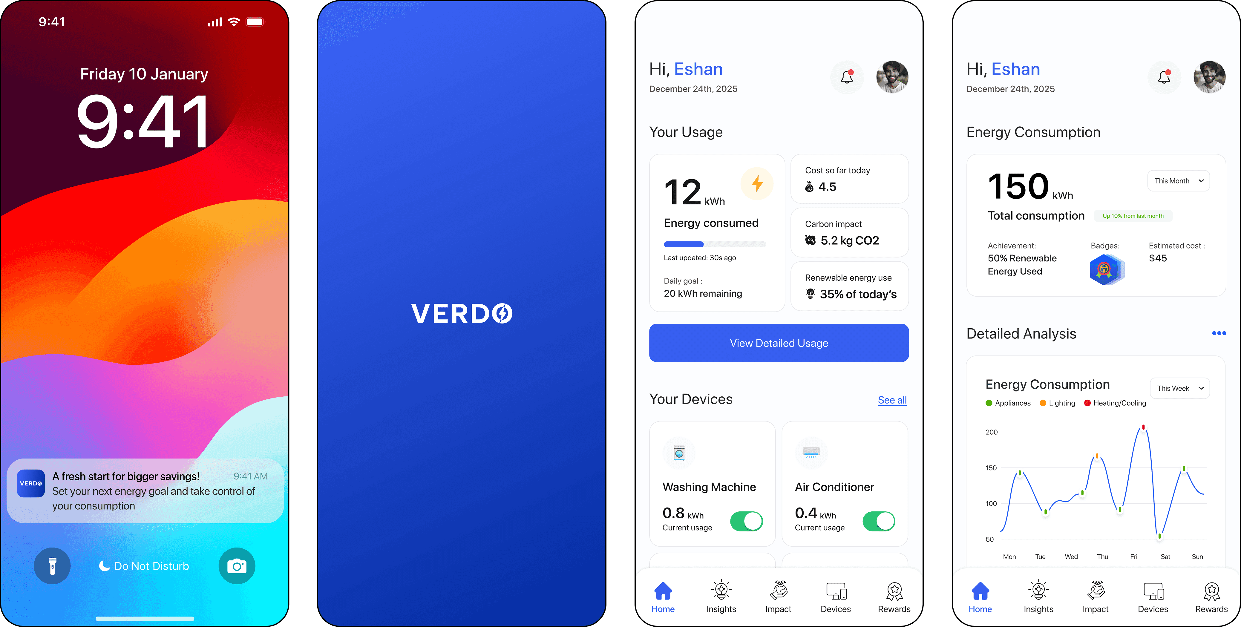
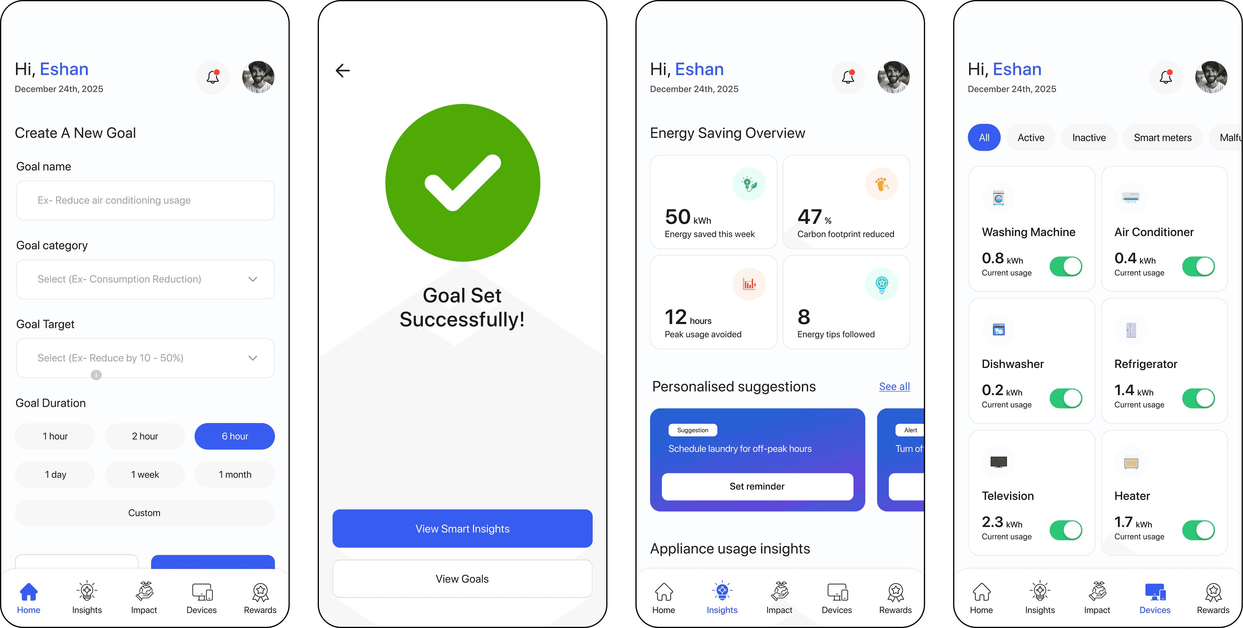
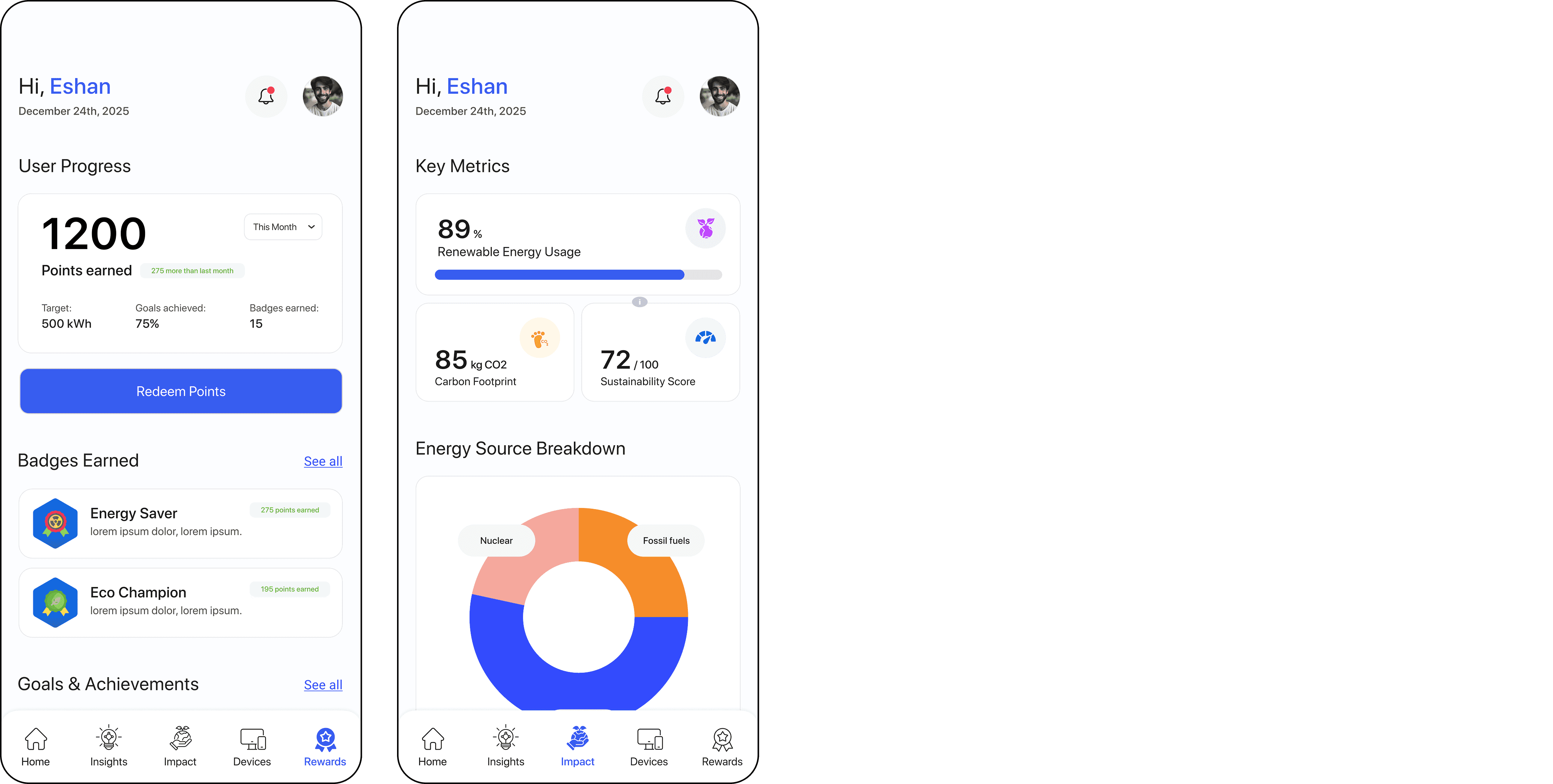
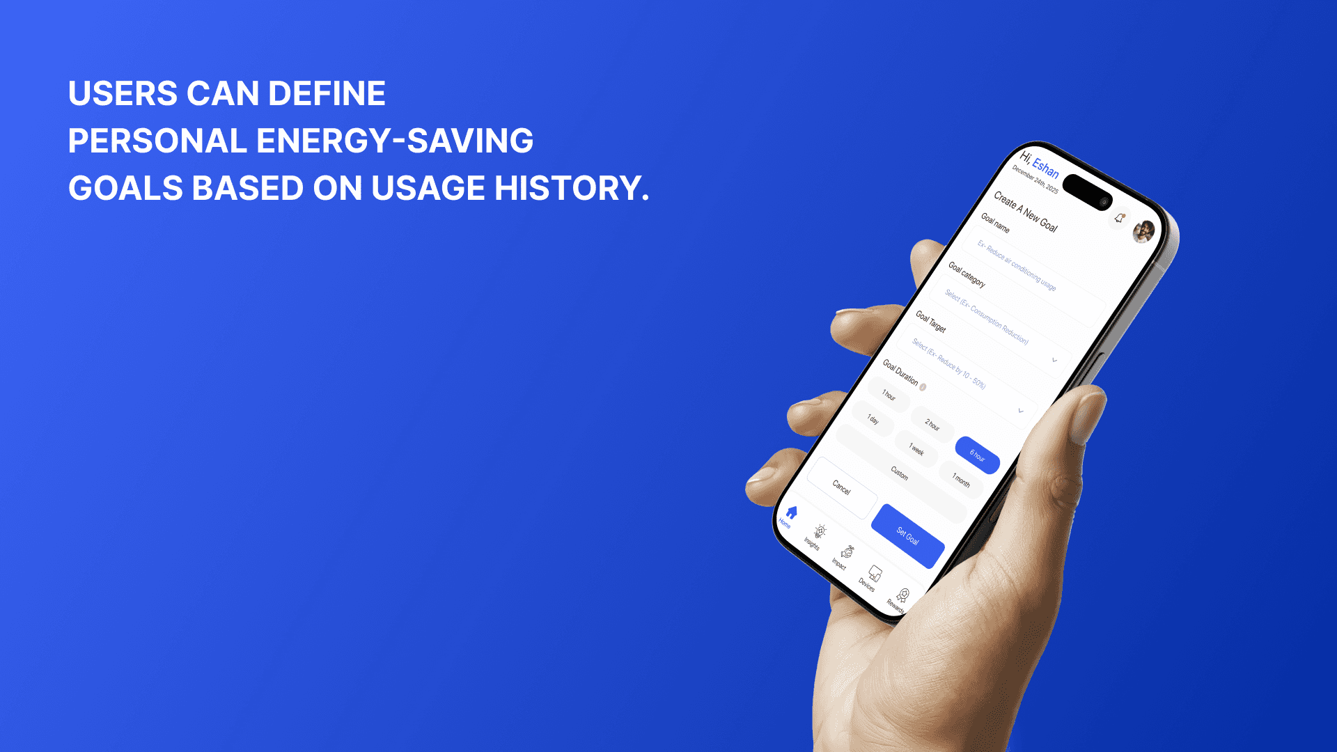
Verdo is a mobile app designed to transform how people interact with their energy usage. It connects to smart meters and provides intuitive insights, daily usage breakdowns, and personalized recommendations. With mood tracking, reward nudges, and trend visualizations, Verdo makes energy-saving feel simple, personal, and empowering.




PROCESS
01 - Context & Problem
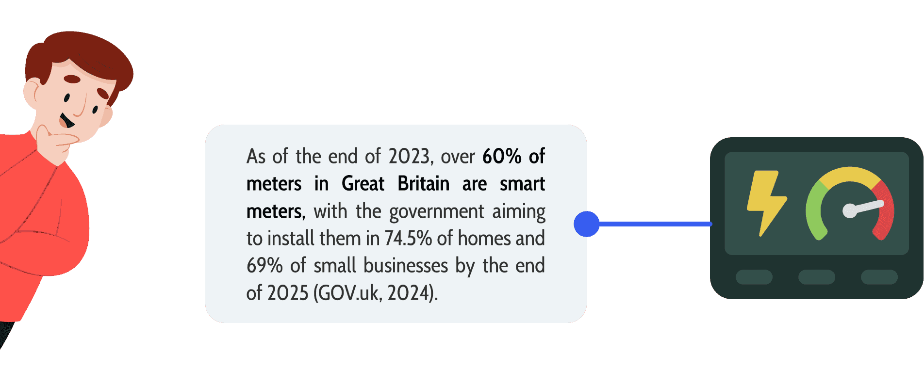
The energy sector contributes around 75% of greenhouse gas emissions, with UK households seeing a consistent rise in electricity usage.
While smart meters have been introduced to help households track usage in real time, they often fail to convert technical data into meaningful, everyday actions. Many users are left confused, unsure of when or how to cut down consumption - and miss out on savings or sustainability benefits.
Verdo was born from this gap. It bridges the disconnect between energy data and decision-making, through personalized tips, visual feedback, and smart goal tracking.
My goal: To help users take control of their energy use and reduce bills, without needing to be data experts.
02 - Understanding User Mindset
This set of users is motivated by growing electricity costs and awareness of climate change to reduce utility bills and embrace eco-friendly behaviors. Complex energy systems, expensive devices, and a dearth of transparent, real-time data frequently irritate them. These tech-savvy consumers, who are used to smartphones and applications, are receptive to user-friendly platforms that offer practical insights and make energy management easier.

03 - Goals & Objectives
Empower users with real-time energy tracking.
Simplify complex data into easily digestible visuals.
Encourage sustainable habits through nudges and notifications.
04 - Discover Phase
The design process starts with the discovery phase, which focuses on learning about the issue area and obtaining insights. Identifying user needs, investigating market prospects, and figuring out how the app could successfully encourage energy-saving behavior were the objectives for Verdo at this point.
Initial assumptions & hypothesis
A number of assumptions on user behavior and its connection to energy use were made in the beginning. It was believed that most users lacked detailed knowledge about their energy usage patterns and relied heavily on monthly bills to gauge consumption. Another assumption was that users valued sustainability but often prioritized convenience over active energy-saving measures.
Users were assumed to have a general desire to reduce energy costs but lacked the tools to effectively track and manage consumption. Many homeowners were thought to be aware of energy-efficient practices but felt uncertain about their impact (Firedog, 2024).


Key Insights
The discovery phase revealed critical insights that directly influenced the design and functionality of the app. Through secondary research and analysis of existing solutions, several themes emerged, highlighting the essential elements users expect from an energy management tool.
Real-time Feedback: Users wanted instant insights into their energy usage to make quick, informed adjustments, as delayed feedback from bills was ineffective.
Gamification & Incentives: Rewards and challenges motivated users to adopt sustainable habits, making energy-saving feel engaging and achievable.
Simplified Visualization: Users preferred clear, easy-to-understand graphs over complex data, allowing them to track and manage energy consumption effortlessly (Eriksen, 2024).

05 - Define Phase
The Define phase serves as a critical point in the design process, transforming insights gathered during discovery into clear, actionable problem statements. This stage is essential for narrowing the focus and ensuring the team addresses the most pressing user needs and pain points. The Define stage's main goal is to compress research results into clearly stated design challenges (Stevens, 2021).
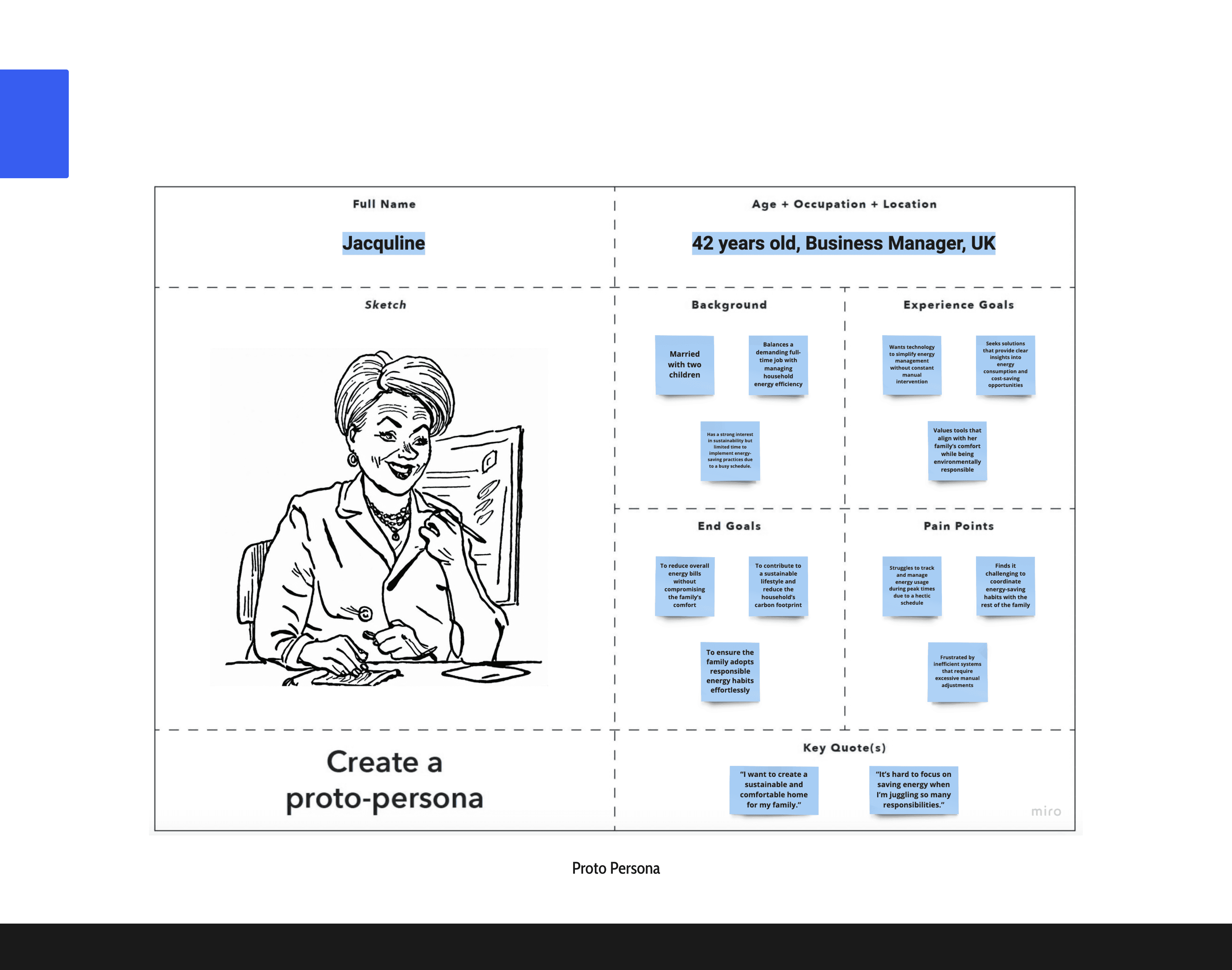
To ensure the design process was user-centred, proto-personas were developed to represent key household members – typically a mom, dad, and daughters. These personas served as initial representations of the target users, reflecting their unique behaviours, goals, and frustrations regarding energy consumption (Laubheimer, 2020).
User Need Statement
User need statements were developed to articulate the specific requirements and motivations of each family member. The process involved synthesising insights from interviews and observations and translating them into actionable statements that reflect real-life goals and frustrations (Gibbons, 2019).
Daughters expressed a need for gamified and engaging features to stay motivated, aligning energy-saving activities with their tech-savvy habits. The mother prioritised visibility and control, desiring real-time data to manage peak consumption times and track sustainability efforts.
Meanwhile, the father sought efficiency, favouring quick recommendations and alerts to balance energy management with his professional responsibilities. These need statements provided a clear direction for design, ensuring the app addressed distinct user behaviours while fostering a shared household commitment to reducing energy consumption.

Final User Need Statements
“As a family striving to reduce energy consumption and contribute to sustainability, we need an intuitive and engaging app that provides real-time insights, personalised recommendations, and gamified features. This will help us manage household energy use efficiently, stay motivated, and track our progress toward lowering costs and minimising environmental impact without disrupting our daily routines.”
Experience Design Principles

06 - Design Phase
The design phase focuses on translating user needs and research insights into tangible features that directly address key pain points. This stage bridges the gap between problem definition and solution development, ensuring the final product aligns with user expectations and goals (Hunt, 2024).
Feature Prioritisation Matrix
Must Provide – Core features essential for the app’s success, such as real-time energy tracking, smart meter integration, and future bill prediction.
Should Provide – Important but non-essential features like AI usage suggestions and renewable energy encouragement.
Could Provide – Features that enhance the experience but are not critical, such as gamified challenges and user rewards.
Won’t Provide – Features that may not add significant value at the initial stage, allowing for focus on high-impact ideas.

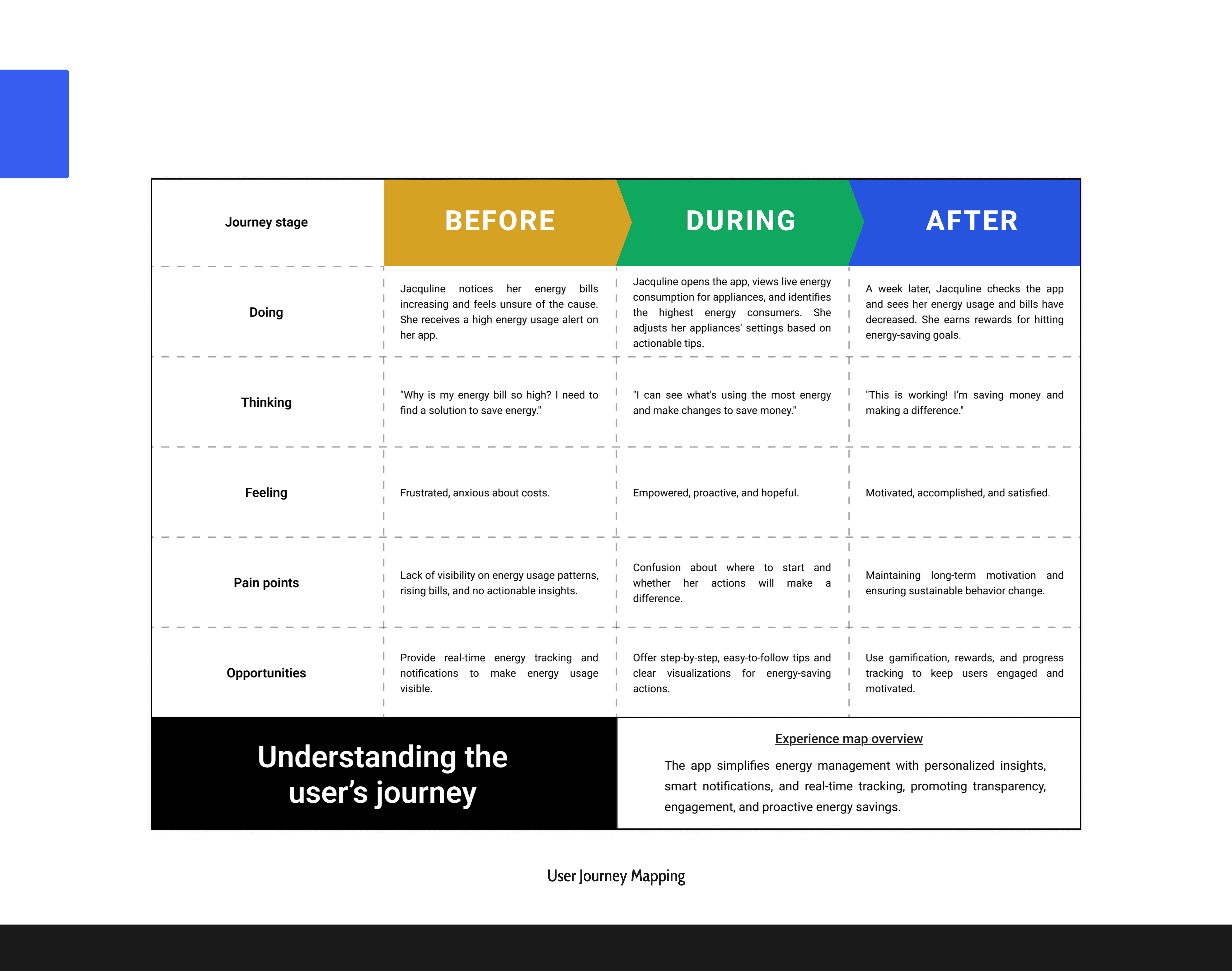
User Journey Mapping
User journey mapping provides a structured overview of user behaviour, ensuring the design aligns with their needs and expectations. For this energy-saving app, the journey map allowed us to capture the user's experience before, during, and after engaging with the app. This insight proved valuable in crafting features that address user frustrations and sustain engagement over time (Gibbons, 2018).
Storyboarding
Storyboarding was used to visualise the user's experience step by step, ensuring a clear understanding of how they interact with the energy-saving app. By mapping out key moments, from receiving high-energy alerts to adjusting appliance settings and tracking progress, storyboarding highlighted user emotions, pain points, and opportunities (Hannah, 2023). This process helped identify gaps in the design, ensuring features like real-time tracking, actionable tips, and rewards aligned with user needs.

User flow
The user flow illustrates the step-by-step journey of interacting with the energy monitoring app (Browne, 2024), guiding users from accessing the dashboard to actively reducing energy consumption. This process begins when the user opens the app, views their energy overview, and navigates through detailed usage insights to identify high-consuming appliances. The app prompts users to set energy goals, adjust device settings, and track their progress, reinforcing positive behaviour with rewards and badges.

Sitemap
The sitemap was created to provide a structured overview of the app’s architecture, ensuring that all features and functionalities align seamlessly with the user flow. It acts as a blueprint for organising the app's core elements—Dashboard, Smart Insights, Environmental Impact, Devices, and Rewards—allowing users to navigate intuitively and achieve their goals efficiently (Guthrie, 2022). By aligning the sitemap with the user flow, I ensured that each component supported the user's journey, such as tracking energy consumption, setting goals, or receiving recommendations.

Lo-Fi Design / Sketches
Creating low-fidelity hand-drawn wireframes to visualize the primary user journey, ensuring alignment with the key user story and task (Figma, 2020). The flow reflects a homeowner’s goal of managing energy usage effectively. Starting at the homepage, the user navigates through detailed energy insights, sets energy-saving goals, adjusts devices, and tracks progress through achievements and rewards.

These sketches provided a blueprint for seamless user interactions, emphasizing clarity and simplicity at each step. The flow ensures a user-centric approach, guiding homeowners through managing energy use effectively while rewarding sustainable actions.
Lo-Fi Prototype Evaluation
The evaluation followed the ‘Question, Plan, Test, Reflect’ framework, ensuring a structured process. During testing, the ‘Think Aloud Protocol’ was employed, allowing participants to share their thoughts and experiences in real time while navigating the prototype (Nielsen, 2012).
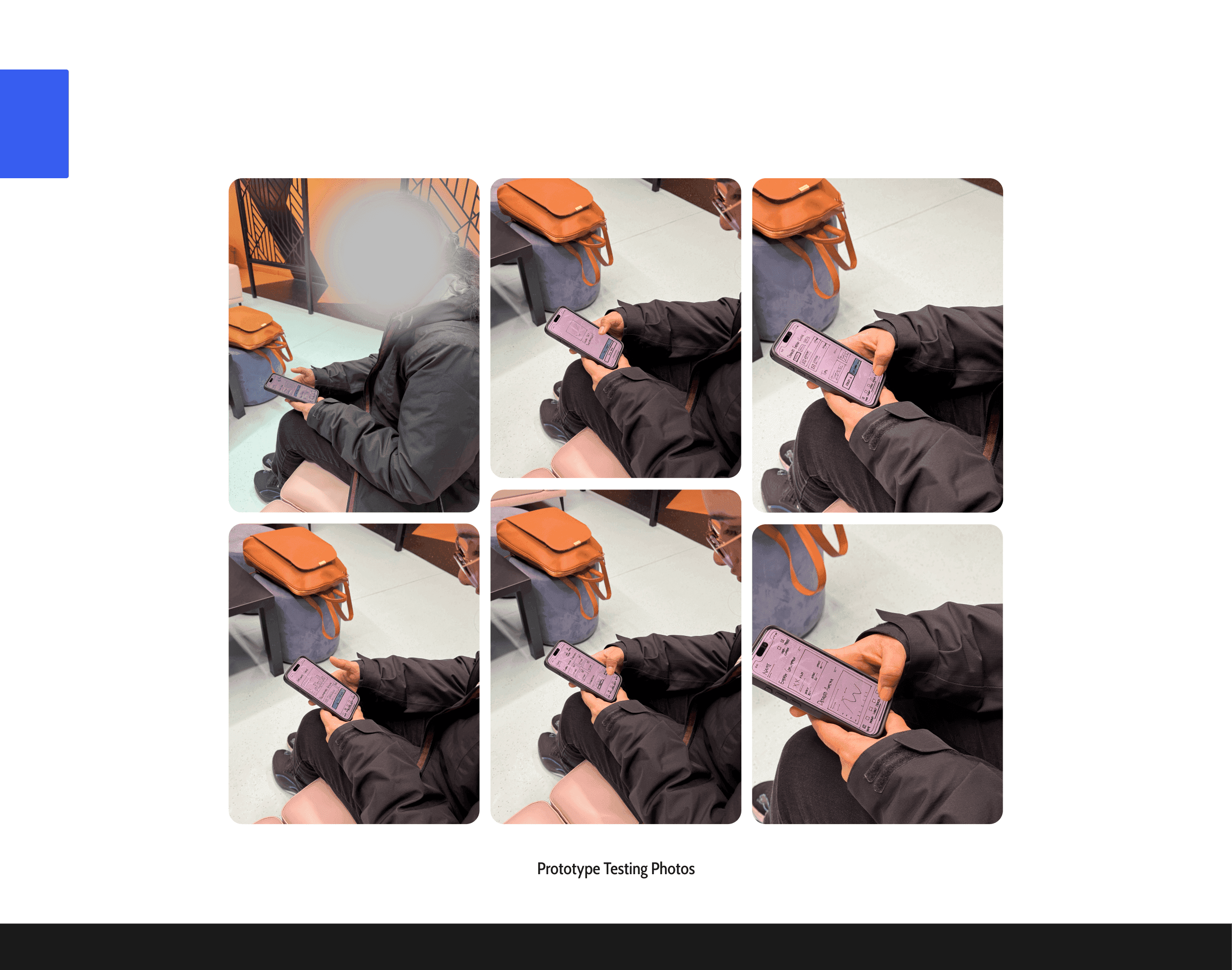
Lo-Fi Prototype Documentation
The prototyping sessions were documented through photos and detailed notes, capturing user interactions and feedback. The process not only refined the user flow but also provided fresh perspectives on how users approached and engaged with the app. These adjustments significantly improved usability and the overall experience.