Dubai Customs
Reducing task completion time by 35% through a redesigned Dubai Customs operations dashboard (NDA Project)

Redesigning a mission-critical internal dashboard for one of the world's busiest customs operations, reducing cognitive load and accelerating task completion at scale.

Project Type
role
time line
Tools

The Problem
A legacy system holding operations back
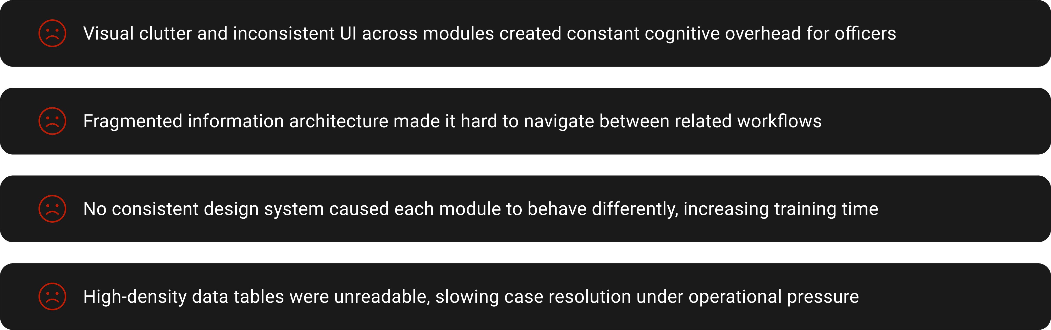
Dubai Customs was operating on an outdated internal system struggling under complex workflows and high-volume data. The interface was cluttered, unintuitive, and slowed down decision-making for officers across multiple departments.
The Challenge
Redesigning the platform into a clean, modern system that could simplify navigation, reduce cognitive load, and support seamless operations at scale, without sacrificing performance or clarity.
Pain-Points-
My Contributions
What I brought to the table -
PROCESS
01 - Project Understanding & Briefing
As my first major assignment at the company, I was introduced to Dubai Customs and briefed on the core challenges of their existing internal system. The platform suffered from poor usability, visual clutter, and a fragmented structure, all impacting operational speed and efficiency across departments. The objective was clear: simplify the experience without compromising on functionality.

02 - Competitive & UI Audit
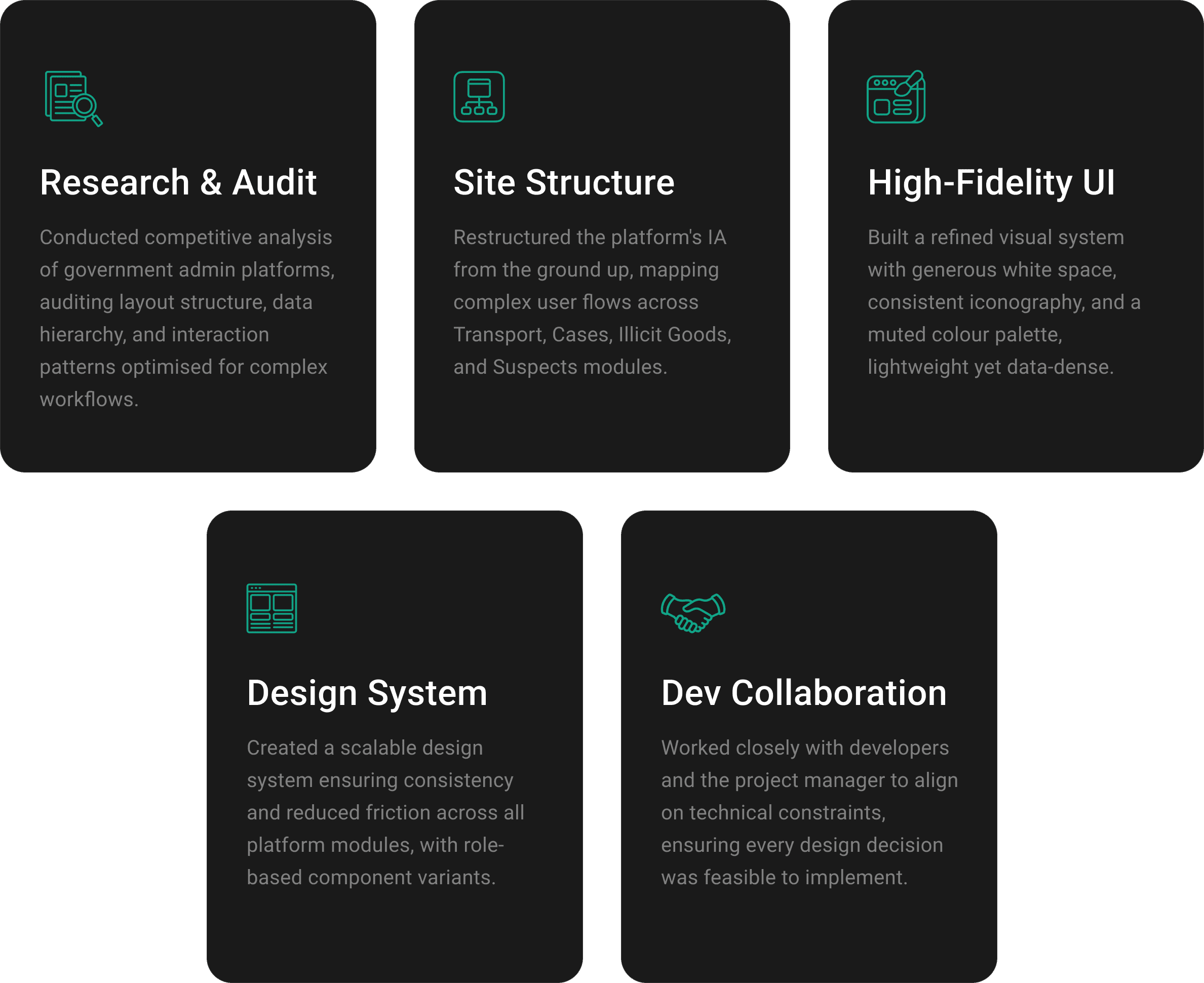
I conducted a competitive analysis of government admin platforms and high-density dashboards, focusing on layout structure, data hierarchy, and interaction patterns optimised for complex workflows. The existing system audit revealed cluttered visuals, inconsistent logic, and a lack of prioritisation.

03 - INFORMATION ARCHITECTURE & USER FLOW
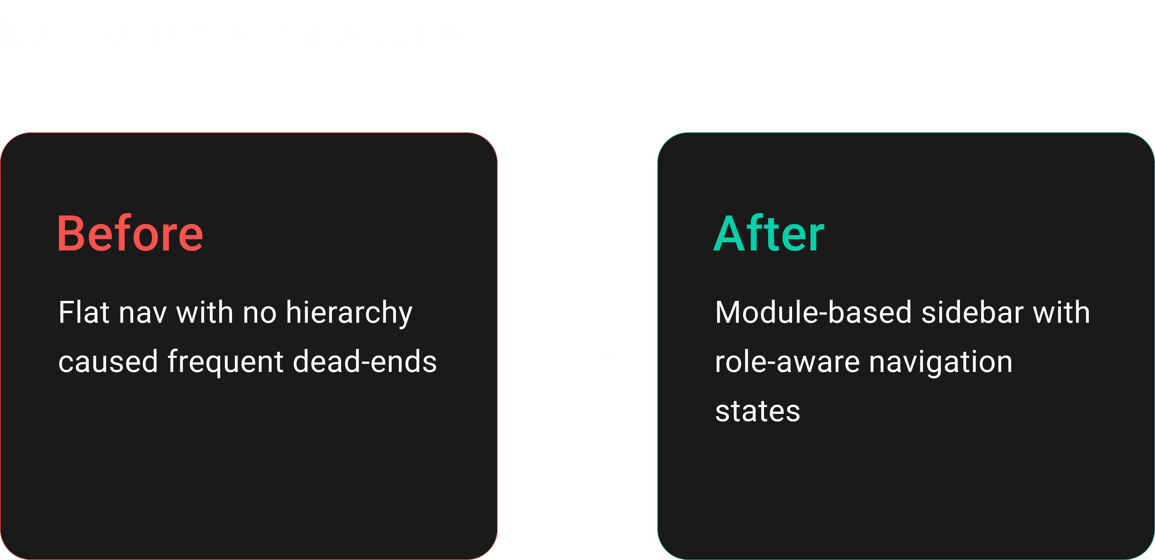
In collaboration with the development team, I restructured the platform's information architecture from the ground up. Mapped out complex user flows across key modules, Transport Vehicles, Cases, Illicit Goods, and Suspects, focusing on streamlining navigation and enabling faster, more intuitive task execution.

04 - Wireframing & Structural Layout
Designed low-fidelity wireframes across key modules, focusing on clarity, task efficiency, and visual simplicity. Each layout was tailored to support high-volume data without overwhelming the user. I iterated on critical components like the activity log, smuggler watchlist, and role-based user management.

05 - High Fidelity UI Design
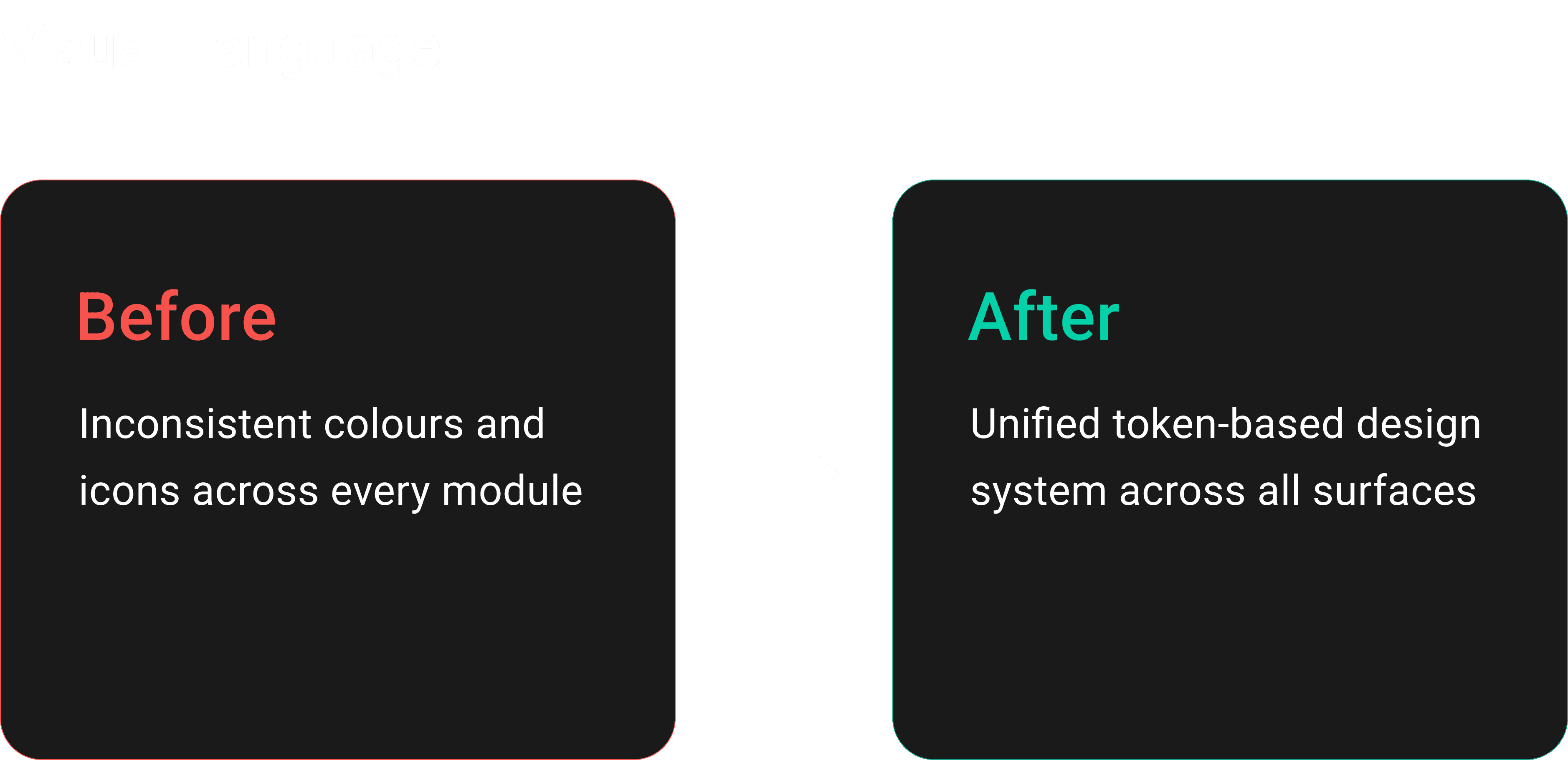
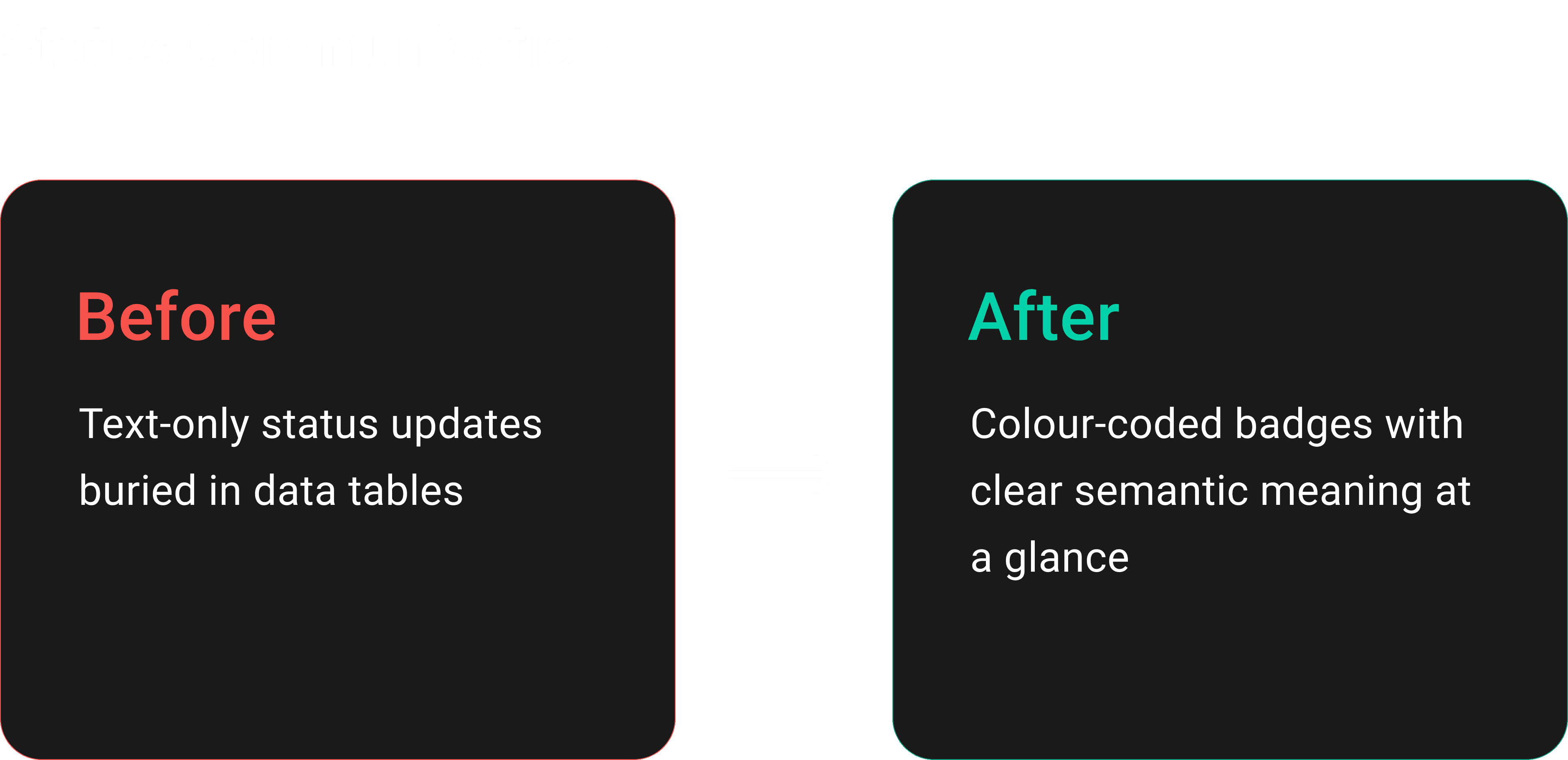
Translated the wireframes into a refined UI using a clean, scalable visual system. Leveraged generous white space, consistent iconography, and a muted colour palette to reduce visual noise. Despite the data-heavy structure, the final design remained lightweight, intuitive, and easy to navigate across user roles.

06 - Review, Iteration & Sign-Off
Designs were reviewed by both the project manager and CEO, who commended the clarity, structure, and usability. Client feedback highlighted the significant improvement, from a cluttered, disjointed interface to a streamlined, user-centric platform.